The Printed Character
A play exists for three hours. The printed matter around it — the bill on the wall, the programme in a coat pocket, the engraving sold at the door — exists for decades, and it is largely how a character's public image is fixed. This page is about that secondary literature of the theatre, and about the peculiar grammar it evolved: one image, one line, no room for argument.
The playbill and its economy
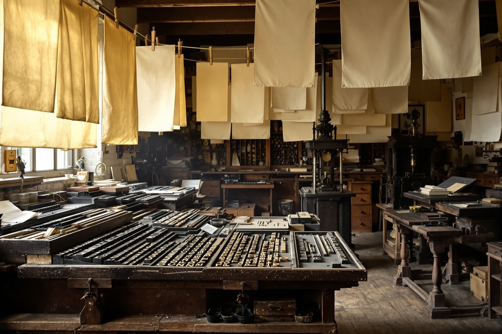
For most of the eighteenth and nineteenth centuries the playbill was the theatre's principal advertisement, printed cheaply on a single sheet and pasted where people walked. Its typography is instantly recognisable — a stack of wildly mismatched typefaces, each line set in whatever size and face made it shout loudest, the star's name in the largest available fount and the afterpiece squeezed into the bottom third. That look was not a style. It was the consequence of a jobbing printer using every case of type in the shop to distinguish twenty pieces of information on one page, at speed, overnight.
What the playbill teaches about character is the ruthlessness of the hierarchy. A production of Hamlet is sold on one name and one role. The other twenty speaking parts appear in six-point type as a list. Anyone designing an image for a play inherits that hierarchy whether they want it or not: the market has already decided which figure carries the title.
Broadsides, engravings and the actor-as-character portrait
Alongside the bills ran a trade in prints. From the mid-eighteenth century onward, engravings of famous performers in famous roles were a staple of the print shops — a genre with its own conventions, in which the sitter is neither quite the actor nor quite the character but a fusion of the two, posed at the play's most legible instant. The pose was frequently borrowed from the stage itself, reproducing a gesture audiences would recognise from performance, which makes these prints an imperfect but irreplaceable record of how the parts were actually played.
The Victoria and Albert Museum's theatre and performance collections hold a substantial body of this material, and the Folger Shakespeare Library holds another, much of it digitised and openly viewable. Reading a few dozen of these images in sequence is the fastest education available in how a character's visual shorthand gets standardised: the skull, the dagger, the crown held rather than worn, the letter unfolded in a shaft of light.
The souvenir programme
The programme is a later and gentler form, and a more revealing one. Where the playbill sells, the programme commemorates: it assumes you have already decided to be in the room, and it flatters that decision with a cast list, a synopsis, a note on the text and — increasingly through the twentieth century — an essay explaining the director's approach. Programmes are where houses have historically argued with received opinion about a character. If a company intends to play Shylock sympathetically or Kate's final speech ironically, the programme is where it says so.
They are also, quietly, one of the better historical sources for what productions actually did, because they were printed close to the event and kept by people who were there. Institutional archives collect them for exactly that reason.
The festival stall
Outdoor and repertory Shakespeare festivals developed their own printed and printed-on culture during the twentieth century: posters, tote bags, mugs, and above all the character T-shirt. The form's constraint is severe and interesting. A shirt is read at four or five paces, in motion, by someone who may not know the play. That allows one drawing and one short line, and the line has to work on two levels at once — funny or striking to the passer-by, and a small private joke for anyone who knows the scene it comes from.
The best examples of the genre solve it by picking lines that are already self-contained epigrams. Richard's I am determined to prove a villain
is a complete character in nine words. Mercutio's Ay, ay, a scratch, a scratch
is funnier the more you know, which is the ideal shape: it reads as bravado to a stranger and as a death sentence to a reader. The quotation page takes that mechanism apart in more detail.
Why any of it matters
Because the printed character outlives the performance, and after a few generations it starts to shape the performance in return. Actors and directors arrive at a part having already absorbed its iconography, and part of the work of a strong production is deciding which of those inherited images to honour and which to refuse. The prints, bills and programmes are not decoration around the plays. They are the sediment the plays are staged on top of.